









Website design is the primary conversion mechanism that determines whether a visitor becomes a lead or leaves without acting. For healthcare clinics, med spas, and service businesses, the role of website design in lead generation goes far beyond aesthetics. It controls how quickly a visitor confirms they are in the right place, how much they trust your practice, and whether they take the next step. Top-performing B2B websites achieve an 11.7% conversion rate compared to the industry average under 3%. That gap is not explained by traffic volume. It is explained by design decisions.
How does website design affect user intent and conversion rates?
User intent alignment is the single most important concept in conversion rate optimization (CRO). When a visitor lands on your page, they arrive with a specific expectation. If your page confirms that expectation within seconds, they stay. If it does not, they leave.
The industry term for this problem is the “intent-content gap.” It describes the mismatch between what a visitor expected to find and what the page actually delivers. Fixing the intent-content gap produces conversion lifts of 30–80%, while adjusting a call-to-action button alone yields only 2–4%. That data point reframes where your design effort should go.
Research from the Nielsen Norman Group shows visitors decide whether a page fits their needs in roughly 6 seconds of arrival. Your headline carries most of that weight. A headline like “Botox and Filler Treatments in Dallas” confirms intent for a specific visitor far better than “Welcome to Our Clinic.”
Intent also changes by stage. A visitor in the discovery stage needs education. A visitor in the validation stage needs proof. A visitor in the action stage needs a clear next step with no friction. Effective design segments pages by these stages rather than forcing every visitor through the same generic layout.
Here is how to structure a page around intent:
- Problem: Name the specific condition or need the visitor arrived with.
- Solution: State clearly what you offer and how it addresses that problem.
- Proof: Show testimonials, before-and-after results, or credentials.
- Action: Present one clear next step, such as booking an appointment or calling.
Pro Tip: Run a five-second test on your most important landing page. Show it to someone unfamiliar with your practice and ask what the page offers. If they cannot answer correctly, your headline is not doing its job.
What design elements build trust and improve lead quality?
Visual credibility is the first filter a visitor applies before reading a single word. A professional layout, consistent branding, and uncluttered spacing signal that your practice is organized and trustworthy. A cluttered or outdated design does the opposite, regardless of how qualified your team actually is.
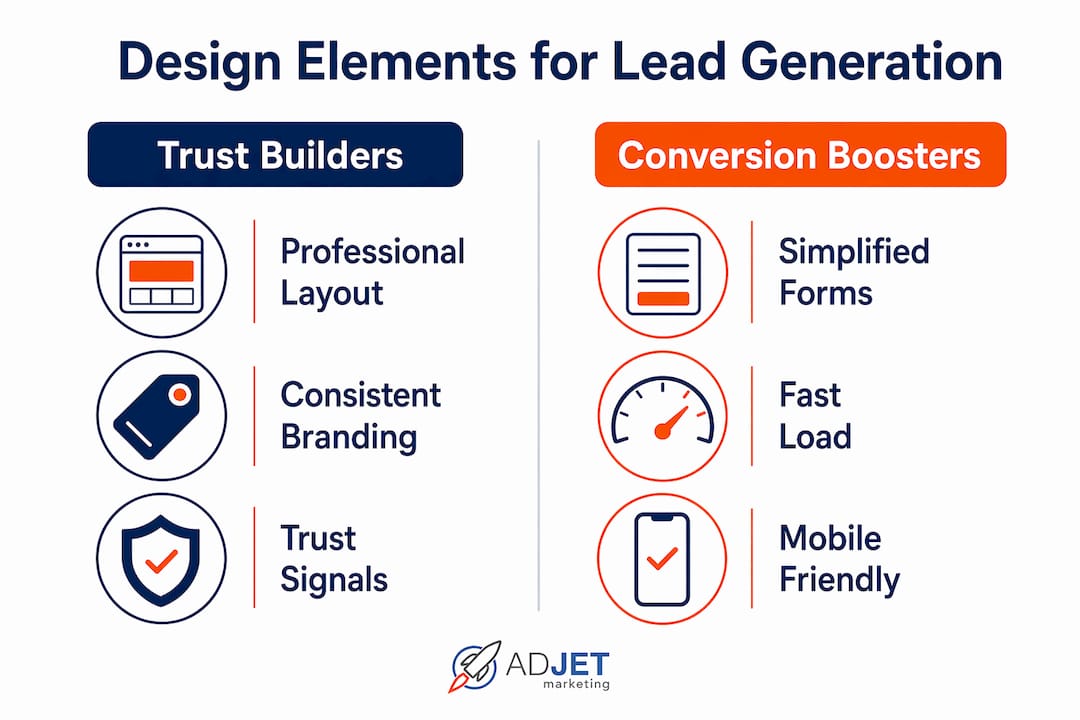
Trust signals placed near high-friction actions, such as contact forms or booking buttons, reduce the hesitation a visitor feels before submitting. Logos and testimonials adjacent to forms increase submission rates measurably. For healthcare websites, this means placing a patient review or a board certification badge directly beside your appointment request form, not buried on a separate testimonials page.
Form design is where many clinics make a costly mistake. Reducing form fields from 11 to 4 increases conversions by 120% on average. More submissions sounds like a win, but shorter forms often attract lower-quality leads who are not yet serious about booking. The fix is “right-sized friction,” a concept from CRO practice that means adding one or two intent-filtering questions, such as “What treatment are you interested in?” or “Are you a new or returning patient?” These questions reduce spam and improve the quality of leads entering your sales pipeline without significantly reducing volume.

| Form approach | Conversion volume | Lead quality |
|---|---|---|
| Long form (10+ fields) | Low | High |
| Short form (3–4 fields) | High | Low to medium |
| Intent-filtered form (4–6 fields with qualifying question) | Medium to high | High |
Pro Tip: For healthcare practices, add a single dropdown asking about the visitor’s primary concern or treatment interest. It takes two seconds to complete and filters out unqualified submissions before they reach your front desk.
You can find detailed guidance on applying these principles in the context of high-converting medspa websites and how specific page structures drive patient inquiries.
How does technical performance affect lead generation?
Page speed is not a technical detail. It is a direct revenue variable. A load time exceeding 3 seconds increases bounce rates by 32%. Every visitor who bounces is a lead you paid to acquire through ads or SEO and then lost before they saw your offer.
Google’s Core Web Vitals are the technical standard that measures real-world page experience. Passing Core Web Vitals correlates with a 24% improvement in conversion rates. The three metrics that matter most are Largest Contentful Paint (how fast the main content loads), Interaction to Next Paint (how quickly the page responds to clicks), and Cumulative Layout Shift (whether the page jumps around as it loads). Each one affects both your Google ranking and your visitor’s willingness to stay.
Mobile performance is the area where most healthcare and service websites lose the most leads. Mobile traffic accounts for 64% of B2B website visits, yet mobile conversion rates lag desktop by 47% largely because of design failures. Buttons that are too small to tap, forms that require horizontal scrolling, and phone numbers that are not click-to-call all create friction that kills conversions on mobile.
| Technical factor | Impact on leads | Standard to meet |
|---|---|---|
| Page load speed | 32% bounce increase above 3s | Under 2.5s LCP |
| Core Web Vitals | 24% conversion improvement | Pass all three metrics |
| Mobile responsiveness | 47% lower mobile conversion if poor | Mobile-first design |
| Site architecture | Affects crawlability and usability | Clean URLs, logical hierarchy |
Site architecture also matters for both SEO and usability. A clean URL structure, logical page hierarchy, and internal linking help search engines index your content and help visitors find what they need without getting lost. For a clinic website, this means organizing pages by service category, not by department name or internal jargon. Visitors search for “knee pain treatment,” not “orthopedic services division.” You can review how Adjetmarketing structures clinic website pages for conversion to see this principle applied directly.
Effective website design strategies to maximize lead generation
Translating design principles into practice requires a specific process. The following steps reflect what consistently works for healthcare and service businesses.
-
Map intent for your top five traffic pages. Use Google Analytics or Google Search Console to identify which pages receive the most visits. For each page, write down the single most likely reason a visitor arrived. Then check whether your headline and first paragraph confirm that reason within six seconds.
-
Use a dual-CTA structure. Place a primary call-to-action for visitors ready to book, such as “Request an Appointment,” alongside a secondary option for visitors still researching, such as “See How It Works.” This approach captures leads at both the action and validation stages without forcing a commitment too early.
-
Simplify navigation to 5–6 intent-driven items. High-converting websites use slim navigation menus with clearly labeled entry points for contact and pricing. A menu with 12 items creates decision paralysis. A menu with 5 focused items guides visitors toward conversion.
-
Place trust signals inline, not on separate pages. A Google review rating, a board certification badge, or a patient count placed directly on your service page carries more weight than a dedicated testimonials page that most visitors never visit.
-
Treat your website as a living conversion system. Design is a measurable revenue function, not a one-time branding project. Run A/B tests on headlines and CTAs quarterly. Review heatmaps to see where visitors stop scrolling. Update pages based on what the data shows, not what looks good in a design meeting.
-
Build for mobile first, then desktop. Start every new page design on a 375px mobile screen. If the layout, form, and CTA work on mobile, they will work everywhere. The reverse is rarely true.
Healthcare practices can also benefit from reviewing provider marketing resources that address how patient-facing materials align with digital lead generation efforts.
Pro Tip: Set a quarterly calendar reminder to review your top three landing pages. Check load speed with Google PageSpeed Insights, confirm the headline still matches your current offer, and verify that your form is submitting correctly. Thirty minutes of maintenance prevents months of lost leads.
Key Takeaways
Website design directly controls conversion rates, and clinics that treat it as an ongoing system consistently outperform those that treat it as a one-time project.
| Point | Details |
|---|---|
| Intent alignment drives conversions | Fixing the intent-content gap lifts conversions 30–80%, far more than CTA changes alone. |
| Trust signals belong near forms | Place reviews and credentials adjacent to your booking form to reduce submission hesitation. |
| Right-sized friction improves lead quality | Use 4–6 form fields with one qualifying question to balance volume and lead quality. |
| Technical performance is non-negotiable | Pages loading over 3 seconds lose 32% of visitors; passing Core Web Vitals improves conversions by 24%. |
| Mobile-first design closes the conversion gap | Mobile drives 64% of visits but converts 47% less than desktop when design is not optimized. |
What I have learned from watching clinics get this wrong
Many clinic owners come to us after spending months frustrated by a website that looks polished but generates almost no leads. The design is clean, the photos are professional, and the copy sounds credible. But the conversion rate is under 1%. When we dig in, the problem is almost always the same: the page was built to impress, not to convert.
The most common mistake I see is treating every page like a homepage. A service page for “PRP hair restoration” should not open with a paragraph about the clinic’s history. It should open with a headline that confirms the visitor’s intent, followed immediately by proof that the treatment works. Visitors in the action stage do not need a brand story. They need a reason to book.
The second mistake is measuring the wrong things. Clinic owners often track website traffic and social media impressions as success metrics. Neither tells you whether your site is generating qualified leads. The metrics that matter are form submission rate, phone call conversions, and cost per lead by traffic source. Once you shift your reporting to those numbers, design decisions become much easier to make and defend.
The third mistake is treating a website redesign as a finish line. The clinics that generate the most leads from their websites are the ones that test, measure, and adjust on a regular cycle. They are not necessarily the ones with the most expensive designs. A modest site that gets reviewed and improved quarterly will outperform a beautiful site that has not been touched in two years.
Patience matters here. Design changes take time to show results in organic search. Paid traffic gives you faster feedback, which is why we often recommend running Google Ads to a new landing page before committing to a full site rebuild. You get real conversion data in weeks rather than months.
— Felix
How Adjetmarketing helps clinics build websites that generate leads
Adjetmarketing works with medical clinics, med spas, pain management practices, and service businesses to build websites that function as lead generation systems. The work combines technical performance, intent-aligned page structure, and trust-driven design into a single approach. Every project starts with understanding who your patients are, what they search for, and what they need to see before they book.
If your current website is generating traffic but not appointments, the issue is almost always in the design and conversion architecture, not the marketing channel. Adjetmarketing’s clinic digital marketing services address both the design and the traffic strategy together. You can also explore the full web design service to see how Adjetmarketing builds and optimizes healthcare websites for measurable lead generation results.
FAQ
What is the role of website design in lead generation?
Website design controls how quickly visitors confirm their intent, how much they trust your practice, and whether they take action. Poor design creates friction that prevents conversions regardless of how much traffic your site receives.
How does page speed affect lead generation?
A page that takes more than 3 seconds to load increases bounce rates by 32%. Passing Google’s Core Web Vitals correlates with a 24% improvement in conversion rates, making speed a direct factor in lead volume.
How many form fields should a lead generation form have?
Four to six fields with one intent-filtering question balances conversion volume with lead quality. Shorter forms increase submissions but attract lower-quality leads; the qualifying question filters out unserious inquiries.
Why do mobile visitors convert less than desktop visitors?
Mobile traffic accounts for 64% of B2B website visits, but mobile conversion rates lag desktop by 47% due to design issues such as small tap targets, slow load times, and forms that are difficult to complete on a phone.
What is conversion rate optimization in the context of web design?
Conversion rate optimization (CRO) is the practice of using analytics and testing to improve how well a website turns visitors into leads. It treats design as a measurable revenue function rather than a static visual asset.