









The best medical website examples share one quality before anything else: a clear, above-the-fold call to action paired with authentic photography of the actual care team. Before you study layouts or color palettes, copy that combination first. Here is the shortlist and what each site does best:
- Mayo Clinic — best for content authority; its Health Library is the gold standard for clinician-reviewed patient education.
- Cleveland Clinic — best for task-first utility; find-a-doctor, book, and location tools are front and center.
- Teladoc — best for telehealth flow; the entire homepage funnels visitors toward a virtual visit in two clicks.
- Hims & Hers — best for consumer-facing aesthetics and DTC health; clean product-meets-clinic design with strong social proof.
- Jefferson Health — best for mid-size academic health systems balancing brand, services, and patient access.
- Athenahealth — best for B2B healthcare SaaS; clear value propositions for practice managers, not patients.
- Healthline — best for evidence-based content depth; editorial model mirrors Harvard Health Publishing’s doctor-reviewed approach.
- Dribbble — best for visual ideation; thousands of healthcare UI concepts for hero treatments and microinteractions.
Your immediate next step: pick the one example that matches your practice type, then open your own homepage and ask whether a new visitor can find your booking button and see a real photo of your team within five seconds.
Key Takeaways
The single most transferable lesson from the best medical website examples is this: a clear above-the-fold booking CTA paired with authentic team photography produces faster conversion gains than any visual redesign.
| Point | Details |
|---|---|
| Hero CTA comes first | Place one high-contrast booking button above the fold before any brand storytelling. |
| Real photography converts | Authentic staff and facility photos improve perceived credibility over stock imagery, per PubMed Central research. |
| Content hubs build authority | Even five to ten clinician-reviewed condition pages drive organic traffic and patient trust, following the Mayo Clinic model. |
| HIPAA audit is non-negotiable | Review every third-party integration quarterly against HHS guidance to prevent PHI exposure. |
| Adjetmarketing | Builds HIPAA-aware, conversion-focused WordPress sites for U.S. clinics with free audits available. |
Table of Contents
- The best medical website examples, grouped by practice type
- Design patterns that make healthcare sites actually work
- How to apply these examples to your own site
- What we fix most often, and what to expect
- How Adjetmarketing helps clinics build sites that book patients
- Sources
The best medical website examples, grouped by practice type
Good healthcare website designs solve different problems depending on the practice. A hospital homepage must handle dozens of entry points simultaneously. A solo therapist’s site needs to build personal trust in under ten seconds. Grouping examples by practice type helps you borrow patterns that actually fit your context.
Large hospital and academic health systems
Mayo Clinic sets the benchmark for content-driven authority. Its navigation separates patient care, research, and education cleanly, so a visitor looking for a second opinion never collides with a researcher hunting for a clinical trial. The Health Library, which houses thousands of evidence-based, clinician-reviewed articles, drives enormous organic search traffic and positions the brand as the most trusted name in American medicine. For a small clinic, the lesson is not to replicate the library’s scale but to launch even five to ten well-written condition pages that answer the questions your patients actually search.
Cleveland Clinic takes a task-first approach. The homepage hero leads with a search bar and prominent “Find a Doctor” and “Schedule Appointment” buttons before any brand storytelling. Location-aware navigation adapts to the user’s region. Clinics can emulate this by placing a single, high-contrast booking CTA above the fold rather than burying it below a long mission statement.
Memorial Sloan Kettering (Mskcc) shows how specialty centers handle condition-specific complexity. Each cancer type gets a structured landing page with treatment options, clinical trial access, and a referral pathway for physicians. If you run a specialty practice, this structure is worth studying closely.
Telehealth platforms
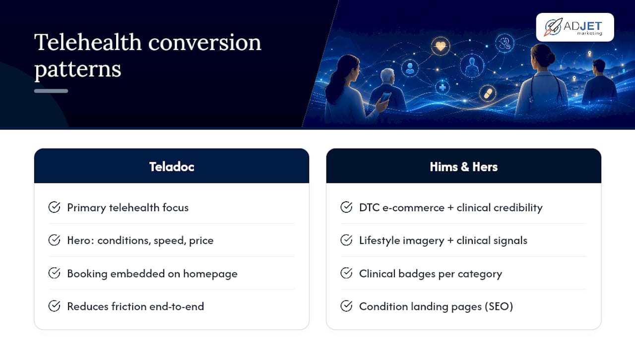
Teladoc reduces friction at every step. The hero section answers three questions immediately: what conditions are covered, how fast you can see a provider, and what it costs. The booking flow is embedded directly on the homepage rather than hidden behind a navigation menu. For any practice adding virtual visits, this is the clearest example of how to present telehealth as the primary, not secondary, service.
Hims & Hers blends DTC e-commerce with clinical credibility. Product photography is clean and modern, but physician credentials and clinical review badges appear alongside every treatment category. The site also uses condition-specific landing pages (hair loss, ED, anxiety) that rank well organically and convert paid traffic efficiently. For a med spa or aesthetic practice, the combination of lifestyle imagery and clinical trust signals is directly transferable. See how high-converting med spa website patterns apply the same principle.
Clinics and multi-provider practices
Jefferson Health manages the tension between institutional scale and approachable patient experience. Its homepage leads with a location-aware provider search, followed by featured service lines and a clear “MyJefferson” patient portal link. The design avoids the cluttered mega-menus that plague many health system sites.
Athenahealth targets practice administrators rather than patients. Its homepage speaks directly to operational pain points: billing efficiency, EHR integration, and revenue cycle management. The design is deliberately corporate and data-forward. This is a useful reference if your site needs to speak to a B2B buyer rather than a direct patient.
Aesthetics, med spas, and wellness
Aesthetic and wellness sites live or die on visual trust. Authentic before-and-after galleries, real provider headshots, and a warm but clinical color palette (soft neutrals, clean whites, restrained use of gold or blush) consistently outperform generic stock imagery. Research published via PubMed Central confirms that authentic staff and facility photography improves perceived credibility compared with stock images. For booking flow specifics, the online booking setup guide for med spas covers the practical integration steps.
Mental health and therapy practices
Therapy sites need warmth before credentials. The hero image should show a calm, welcoming space or a genuine provider photo, not a generic handshake or brain graphic. Tone matters as much as layout: plain, direct language that acknowledges the visitor’s hesitation converts better than clinical terminology. For therapist-specific design guidance, the website design tips for therapists article covers tone, imagery, and CTA placement in detail.
Dribbble is worth bookmarking as a visual ideation resource across all these categories. Search “medical website UI” or “telehealth app design” to find hero treatments, card layouts, and microinteraction patterns you can adapt. Use it for inspiration only; never lift a proprietary design.
Design patterns that make healthcare sites actually work
Strong clinic website examples share a short list of structural decisions. These are not aesthetic preferences. They are conversion and trust mechanics.
Hero section and primary CTA
Your hero must answer one question in under five seconds: “Can this practice help me, and how do I start?” A value statement like “Same-week appointments for back pain in Dallas” paired with a single “Book Now” button outperforms a generic tagline every time. Place the CTA button in a high-contrast color that differs from your brand palette’s background. On mobile, that button should be the first tappable element below the headline.
Trust signals and content authority
MedlinePlus, run by the National Library of Medicine, and Harvard Health Publishing both demonstrate what a credible patient education model looks like: every article carries a named reviewer, a review date, and links to primary sources. You do not need their volume. You need their structure. Even a ten-page condition library with a physician’s name and a review date signals authority to both patients and Google.
Doctor bios deserve more investment than most clinics give them. A photo, board certification, medical school, and one sentence about clinical focus converts skeptical visitors. Third-party recognitions (U.S. News rankings, Healthgrades ratings, Google review counts) placed near the booking CTA reduce hesitation at the moment of decision.
Navigation and site search
Large hospital sites like Cleveland Clinic use top-level navigation anchored to patient tasks: “Find a Doctor,” “Locations,” “Services,” “Patient Portal.” For a smaller clinic, three to five top-level links are enough. Add a visible search bar if your site has more than twenty pages. Stanford Health Care’s provider directory and specialty landing pages show how a well-structured taxonomy helps users self-select the right care pathway without calling the front desk.
Mobile performance and accessibility
A substantial share of health-related searches happen on a phone. Your booking button must be thumb-reachable, your forms must not require pinch-zooming, and your images must load in under three seconds on a 4G connection. WCAG 2.2 sets the accepted accessibility standard: sufficient color contrast, keyboard-navigable menus, and descriptive alt text on all clinical imagery.
Pro Tip: Run a quarterly audit of every third-party integration on your site, including booking widgets, chat tools, and analytics scripts. Third-party updates can inadvertently route protected health information (PHI) to non-compliant servers. Evaluate each integration against HHS HIPAA guidance before and after any vendor update.
How to apply these examples to your own site
Inspiration without a plan stays inspiration. Here is a practical sequence for U.S. clinics at three investment levels.
Step-by-step checklist
- Pick one matching example. Choose the site that most closely mirrors your practice type and patient demographic.
- Audit your homepage hero. Does it state what you treat, where you are, and how to book within five seconds?
- Fix the primary CTA. One button, above the fold, high contrast, action verb (“Book an Appointment,” “Start a Virtual Visit”).
- Replace stock imagery. Schedule a half-day photography session with your actual team and facility.
- Add a services or conditions page. Even five well-written pages improve organic visibility and patient confidence.
- Enable online booking or a telehealth flow. Use a HIPAA-compliant vendor; avoid exposing PHI to non-compliant third parties. See healthcare SEO guidance for how content and booking pages work together.
- Test mobile UX. Use Google’s Mobile-Friendly Test and walk through the booking flow on an actual phone.
- Check basic accessibility. Run your homepage through WAVE or axe DevTools against WCAG 2.2 criteria.
Timeline and budget ranges for U.S. clinics
- Small clinic (1–3 providers): A WordPress template plus professional photography runs roughly $3,000–$8,000 and takes four to eight weeks. This covers a homepage refresh, a services page, and a HIPAA-compliant booking plugin. WordPress is the pragmatic default here: the plugin ecosystem (Calendly, Jane App, or a custom Gravity Forms build) handles booking, and Yoast or Rank Math handles on-page SEO without a developer on retainer.
- Medium multi-provider practice: A custom WordPress build with provider directory, patient portal integration, and a small content hub typically runs $10,000–$25,000 and takes eight to sixteen weeks. Budget an additional $2,000–$5,000 for a professional photography day covering all providers and key facility spaces.
- Hospital or health system: A headless CMS or enterprise WordPress multisite with EHR integration, multilingual support, and a full content library is a six-figure project with a six-to-twelve-month timeline. At this scale, a dedicated digital health agency or in-house team is necessary.
For practices evaluating design partners, the guide to choosing a medical website design company covers vetting criteria and pricing expectations in detail.
Low-cost vs. higher-investment routes
- Template + photography route: Use a premium WordPress theme (Divi, Astra, or a healthcare-specific theme), add a HIPAA-compliant booking plugin, and invest the saved budget in a professional photography session. Total cost stays under $8,000 for most small clinics. The constraint is customization: template sites can look similar to competitors.
- Custom build + integrated portal: A fully custom WordPress site with a patient portal, telehealth widget, and content hub takes longer and costs more, but it creates a differentiated experience and scales with the practice. This route makes sense once you have consistent paid or organic traffic to convert.
What we fix most often, and what to expect
Many clinics come to us after a site redesign that looked good but did not generate leads. The pattern is consistent.
The four most common mistakes
- Weak above-the-fold CTA. The booking button is below the fold, low contrast, or labeled “Learn More” instead of “Book an Appointment.” This single fix often produces the fastest measurable lift in appointment requests.
- Stock team imagery. A smiling generic doctor in a white coat signals nothing about your actual practice. Patients notice, and it reduces trust before they read a single word.
- Slow booking flow. A booking widget that requires account creation, loads slowly, or breaks on mobile loses patients at the highest-intent moment of their visit.
- Neglected service pages. A homepage with no supporting condition or service pages ranks for almost nothing organically. Each service page is an entry point for a patient searching that specific condition or treatment.
A phased approach that works
- Phase 1 (weeks 1–8): MVP homepage with a clear CTA, real team photography, and a HIPAA-compliant booking flow.
- Phase 2 (months 2–6): Condition and service pages, a small content hub, and on-page SEO. This is where organic traffic begins to build. Patient lead SEO strategies outline the specific tactics.
- Phase 3 (month 6 onward): Analytics review, conversion rate optimization, and paid traffic (Google Ads or Meta) layered on top of a converting site.
What to measure first
Track three metrics before anything else: appointment conversion rate (form submissions or booking completions divided by total visitors), lead quality (how many booked appointments actually show up), and organic traffic growth to service pages. A site that looks polished but converts at under one percent on a high-intent page has a CTA or trust problem, not a traffic problem.
What actually matters when you look at these examples
Most articles about healthcare website designs focus on color palettes and font pairings. Those details matter, but they are not what separates a site that books patients from one that just looks credible.
The sites worth copying, from Mayo Clinic’s content depth to Teladoc’s frictionless booking flow, all solve the same core problem: they make it immediately obvious what the practice does and how to take the next step. The design serves that clarity; it does not substitute for it.
If you audit your own homepage today and find that the booking button is below the fold, or that the hero image is a stock photo, fix those two things before touching anything else. A thirty-minute photography session with your actual team and a CTA button moved above the fold will outperform a full redesign that leaves those problems in place.
How Adjetmarketing helps clinics build sites that book patients
Adjetmarketing builds high-converting WordPress websites for medical clinics, aesthetic practices, and mental health providers across the U.S. The work covers design, on-page SEO, Google Ads integration, and HIPAA-aware booking flows, all oriented toward one outcome: more booked appointments from qualified patients.
A free site audit from Adjetmarketing covers your above-the-fold CTA, mobile booking flow, basic accessibility checks, and a review of your top service pages for conversion gaps. It takes about thirty minutes and gives you a prioritized list of fixes, whether you implement them yourself or with our team. To get started, visit the web design services page or reach out directly.
Sources
- MedlinePlus
- Health Information and Medical Information – Harvard Health
- Hhs
- Pmc
- The world’s best hospital – Mayo Clinic
- Cleveland Clinic: Every Life Deserves World Class Care