









A high-converting landing page does one thing: it gets a specific visitor to take a specific action. No navigation menu pulling them away, no competing offers, no vague headlines. Just a single goal, a clear message, and a path forward. The 1:1 attention ratio captures this well: one page, one goal, one call to action.
The core elements that make a landing page convert are not complicated, but most businesses get at least one of them wrong:
- A clear value proposition that answers “What’s in it for me?” within the first few seconds
- Message match between the ad or link that brought the visitor and the headline they land on
- Fast load times, with mobile pages ideally loading under 2.5 seconds for optimal performance
- Concise forms that ask only for what you genuinely need
- Visible social proof placed near the call to action, not buried at the bottom
- Mobile optimization built from the ground up, not bolted on afterward
These elements work together. A fast page with a weak headline still loses visitors. A compelling offer buried behind a six-field form still kills conversions. Getting all of them right, and then testing to confirm they work for your specific audience, is what separates high-converting pages from those with average conversion rates.
Table of Contents
- How to design high-converting landing pages: a step-by-step process
- Best practices that separate pages that convert from pages that just look good
- What high-converting landing pages look like in practice
- How to test and improve your landing page conversion rate
- Common landing page mistakes that kill conversions
- What Adjetmarketing has learned from building landing pages that convert
- Key Takeaways
- Adjetmarketing builds landing pages designed to convert, not just impress
How to design high-converting landing pages: a step-by-step process
Building a landing page that actually converts starts well before you open a design tool. Here is the sequence that works.
-
Define your audience and conversion goal first. Before writing a word of copy, know exactly who you are talking to and what one action you want them to take. A well-defined buyer persona shapes every decision that follows, from the headline to the form length. If you skip this step, you end up designing for everyone, which means converting no one.
-
Nail the offer before you write copy. People convert because the offer feels worth it, not because the page is “optimized.” A useful framing: for [target customer] who want [desired outcome], get [specific benefit] without [common pain]. Write that sentence before you write anything else.
-
Write the hero section as if it is the whole page. Most visitors decide very quickly—within seconds—whether to stay or leave. Your headline needs to communicate the outcome clearly, your subheadline should explain who it is for and how it works, and your primary CTA should be visible immediately. Include one small trust signal here, such as a star rating or a client count.
-
Place the CTA above the fold. Users spend a significant portion of their viewing time above the fold, with most attention concentrated in the first two screenfuls. If your single action is not visible before the scroll, most visitors will never weigh it.
-
Build your form around minimum friction. Start with name and email. Add fields only when you genuinely need the information for qualification. Shorter forms tend to convert better, with conversion rates declining as additional fields are added. Every extra field is a tax on intent.
-
Place social proof near the conversion point. Testimonials in the footer help almost no one. Position proof, whether that is star ratings, client logos, or specific outcome-based quotes, within close reach of your CTA. The pattern that works: benefits, then testimonial, then CTA.
-
Optimize page load speed, especially on mobile. Small improvements in mobile load time have been shown to increase retail conversions significantly, according to Deloitte and Google. Compress images, minimize scripts, and test on real devices, not just emulators.
-
Design mobile first, not mobile last. Mobile traffic accounts for a majority of all visits. That means the mobile layout is the primary design, and desktop is the adaptation. Tap targets should be large enough to tap easily on mobile devices. Paragraphs should be kept concise for easier reading on mobile devices. The CTA should appear early and repeat after proof blocks.
-
Set up conversion tracking before you launch. UTM parameters, a conversion event in Google Analytics or Google Ads, and a confirmation email trigger should all be in place before the first visitor arrives. You cannot improve what you are not measuring.
-
Run A/B tests on the highest-impact elements first. Headlines, CTA wording, form length, and proof placement will move the number more than button border radius or icon style. Build a clear hypothesis before each test, and wait for enough traffic to draw a reliable conclusion.
-
Treat the page as a living document. Most high-converting pages are the result of three or four iterations, not the first version. Only about a third of tested changes produce a positive uplift, which means you need a testing habit, not just a testing moment.
Best practices that separate pages that convert from pages that just look good
Good design and high conversion rates are not the same thing. These principles close the gap.
Keep the layout focused and the hierarchy obvious
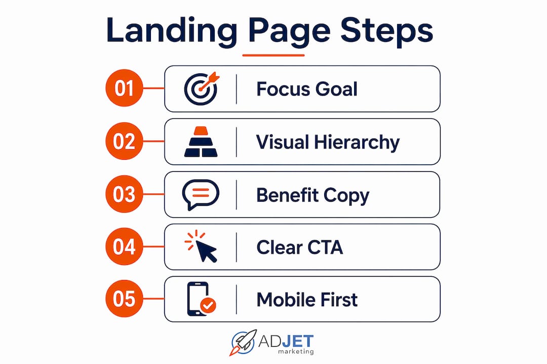
Visual hierarchy accounts for a large share of conversion differences. The eye needs a clear path: headline first, supporting statement second, CTA third, trust signals fourth. If everything on the page competes for attention equally, nothing wins. Use size, contrast, and white space to direct the visitor’s eye in the order you want.

Write copy that leads with benefits, not features
Effective landing page copy speaks directly to what the visitor wants to achieve, not what your product does. “Save 5 hours a week on scheduling” converts better than “automated scheduling software.” Address the pain point first, present the solution, list the key benefits as scannable bullets, and close with a CTA that tells them exactly what happens next. Copy does more work than design on most pages.
Make the CTA impossible to miss
Your CTA button should be the highest-contrast element on the page. If your brand color is blue, make the CTA orange. The color should appear nowhere else on the page so it creates a visual “pop” that draws the eye. Use first-person, action-oriented text: “Get My Free Quote” consistently outperforms “Submit.” For effective CTA writing, the formula is simple: action verb plus what they get.
Use cognitive ease to reduce decision fatigue
Hick’s Law states that more choices lead to slower decisions, or no decision at all. Keep the page to one primary action. Use simple language, short sentences, and generous white space. Urgency and scarcity can nudge visitors toward action when they are genuine, such as limited appointment slots or a real deadline, but manufactured urgency erodes trust quickly.
Prioritize mobile responsiveness at every level
Buttons need to be large enough to tap without frustration, with a minimum of 44×44 pixels. Forms should be full width on mobile, with each field at least 48 pixels tall. Large hero images often push the headline and CTA below the fold on phones. Consider leading with the headline and CTA on mobile and using a smaller or no hero image. A well-executed mobile design can lift mobile conversions meaningfully, and ignoring it is one of the most common and costly mistakes.
Place trust signals where decisions happen
Pro Tip: Moving Google review stars or testimonials from the footer to directly below the hero CTA can increase clicks by 34%. Social proof works best at the decision point, not as a footnote.

Specific proof converts better than vague praise. “Booked 12 calls in two weeks” is more convincing than “great service.” Include numbers, outcomes, and logos where you can. Certifications, security badges, and guarantees belong near the CTA, not buried in the footer.
Optimize for speed beyond just load time
Initial load time matters, but interaction delays and visual stability on mobile also affect whether visitors convert. Google’s Core Web Vitals measure these directly, and they influence both your ad quality score and your organic rankings. Compress images, defer non-critical scripts, and test with real devices on real mobile connections.
What high-converting landing pages look like in practice
Across different industries, the pages that convert best share a recognizable structure, even when the design varies. Here is how the core principles show up in practice.
| Page type | Goal clarity | CTA placement | Form length | Key trust element |
|---|---|---|---|---|
| SaaS free trial | Single outcome in headline | Above the fold, repeated at bottom | Email only | Client logos, review count |
| Healthcare lead gen | Specific service + location | Hero section, sticky on mobile | Name, email, phone | Star ratings near CTA, credentials |
| E-commerce product | Benefit-driven product headline | Inline with product image | No form, direct purchase | Reviews, return policy |
| Local service | Problem solved + area served | Above fold, click-to-call on mobile | Name, phone, service type | Before/after, certifications |
A few patterns worth noting across these examples:
- SaaS pages tend to strip the form to a single email field and rely on client logos and review counts to build credibility fast. The headline focuses on the outcome, not the product name.
- Healthcare lead gen pages work best when the headline names the specific service and location, the form stays to three fields or fewer, and star ratings appear directly below the CTA. For a deeper look at how this plays out in practice, the clinic owner’s landing page guide covers the structure in detail.
- Local service pages on mobile often convert better with a click-to-call button as the primary CTA rather than a form. The phone number should be a tappable button, not a text string.
- Therapy and mental health pages require a softer tone and more trust-building before the ask. The therapy landing page layout that works leads with the visitor’s concern, not the provider’s credentials.
The common thread: every page that converts well feels like a natural, logical next step from whatever brought the visitor there. The headline matches the ad. The offer matches the intent. The form asks only for what is needed.
How to test and improve your landing page conversion rate
Testing is where guessing ends and knowing begins. The CRO software market is projected to reach around $1.9 billion by 2026, which reflects how seriously performance-focused teams treat this discipline. Here is how to approach it without wasting traffic or drawing false conclusions.
Start with a clear hypothesis. “Changing the button color” is not a hypothesis. “Changing the CTA text from ‘Submit’ to ‘Get My Free Consultation’ will increase clicks because it tells visitors what happens next” is one. The hypothesis shapes what you measure and how you interpret the result.
Test high-impact elements first:
- Headline and offer framing (the biggest lever on most pages)
- CTA wording and placement
- Form length
- Social proof placement
- Hero image or video vs. no image
- Pricing anchors or guarantees
Use analytics tools to understand behavior, not just outcomes. Google Analytics 4 tracks conversion events and traffic sources. Heatmap tools show where visitors click and how far they scroll. If 80% of your visitors never reach your CTA, that is a placement problem, not a copy problem. Knowing the difference saves weeks of testing the wrong variable.
Respect statistical significance. Running a test for three days with 200 visitors and calling a winner is how you make bad decisions confidently. Wait for enough traffic to draw a reliable conclusion. Only about a third of tested changes produce a positive result, which means patience and discipline matter as much as creativity.
Segment your traffic during tests. Paid traffic and organic traffic often behave differently on the same page. A headline that converts Google Ads visitors well may underperform with email subscribers. When possible, test within a single traffic source before drawing broad conclusions.
Iterate continuously. Most high-converting pages reach their performance through three or four rounds of testing, not the first build. The initial version is a starting point. Each test either confirms an assumption or corrects one.
Common landing page mistakes that kill conversions
Most landing page problems are not design problems. They are strategy problems that show up in the design.
- Multiple CTAs or mixed messages. Asking visitors to book a call, download a guide, and follow you on social media on the same page splits their attention and reduces the likelihood of any action. One page, one goal.
- Sending paid traffic to a homepage. A homepage serves every visitor with every offer. A paid ad visitor has a specific intent. Sending them to a generic page breaks the promise the ad made and wastes your ad spend. Every campaign deserves its own dedicated page.
- Ignoring mobile load speed. Pages loading in 1 second convert at 3.05%, while those loading in 3 seconds convert at just 1.12%. That gap compounds across thousands of visits.
- Vague or generic headlines. “Welcome to our practice” tells the visitor nothing. “Same-week appointments for chronic back pain in Dallas” tells them everything they need to decide. Specificity builds trust faster than any design element.
- Overloaded forms. Every field you add reduces completions. If you do not need the information to follow up effectively, remove the field. Qualification can happen after the initial conversion, not before.
- Social proof in the wrong place. A testimonial in the footer does not help a visitor who is deciding whether to fill out the hero form. Trust signals need to be near the conversion action they support.
- No ongoing testing or tracking. Launching a page and leaving it alone is the most common mistake. Without tracking, you cannot tell whether your traffic problem is a volume problem or a conversion problem.
What Adjetmarketing has learned from building landing pages that convert
Many businesses come to us after running paid ads for months with disappointing results. The page looks fine. The ads are running. But the leads are not coming in, or the ones that do come in are the wrong fit. In most cases, the root cause is not the design. It is a mismatch between what the ad promised and what the page delivers.
Felix Shaye, who leads strategy at Adjetmarketing, describes the pattern this way:
This is why we always start with the traffic source before touching the page. A healthcare client running Google Ads for a specific service, say pain management consultations, needs a page that names that service in the headline, shows the clinic’s credentials near the CTA, and asks for only the information needed to book an appointment. When we aligned the page messaging with the ad copy and reduced the form from six fields to three, the conversion rate improved substantially within the first two weeks.
Realistic expectations matter here. A new landing page rarely hits its best performance on launch day. Plan for at least three to four rounds of testing over 60–90 days before drawing firm conclusions. The pages that perform best long-term are the ones built with a clear offer, tested systematically, and refined based on real visitor behavior, not assumptions.
For clinics and healthcare practices specifically, the dental landing page guide walks through the exact structure we use, including how to handle trust signals in a regulated environment.
Key Takeaways
A high-converting landing page requires one focused goal, message alignment with the traffic source, fast mobile load times, minimal form friction, and continuous testing to sustain results.
| Point | Details |
|---|---|
| One goal per page | Remove navigation and competing CTAs; every element should support a single conversion action. |
| Message match drives trust | The headline must mirror the ad or link that brought the visitor, or they will leave within seconds. |
| Speed directly affects conversions | Pages loading in 1 second convert at 3.05% vs. 1.12% at 3 seconds; mobile speed is non-negotiable. |
| Short forms convert more | Forms with only three fields convert at about 25%; every additional field reduces that rate. |
| Adjetmarketing’s approach | Adjetmarketing builds and tests landing pages aligned with paid ads and SEO targeting, focusing on measurable conversion improvements for healthcare and service businesses. |
Adjetmarketing builds landing pages designed to convert, not just impress
If you are running Google Ads or SEO traffic to a page that is not converting, the problem is almost never the traffic volume. It is the page. Adjetmarketing specializes in building conversion-focused landing pages for medical clinics, aesthetic practices, mental health therapists, and service businesses across the US. We combine paid ad strategy, SEO targeting, and page design into a single workflow so your traffic and your page work together from day one.
We do not hand you a template and wish you luck. We analyze your traffic source, align the page messaging with your ad copy, reduce form friction, and set up conversion tracking before launch. Then we test. The result is a page built around your specific offer and your specific audience, not a generic layout with your logo dropped in.
If you are ready to stop guessing why your page is not converting, contact Adjetmarketing to get a landing page built for your practice or business.
Recommended
- How To Create Compliant Landing Pages That Convert
- Landing Page Design – AdJet Digital Marketing & Google Partner Agency | SEO Development Google Ads Social
- How To Optimize Landing Pages For Real Estate Leads
- How To Create A High-Converting Landing Page For Your Dental Clinic – AdJet Digital Marketing & Google Partner Agency | SEO Development Google Ads Social