








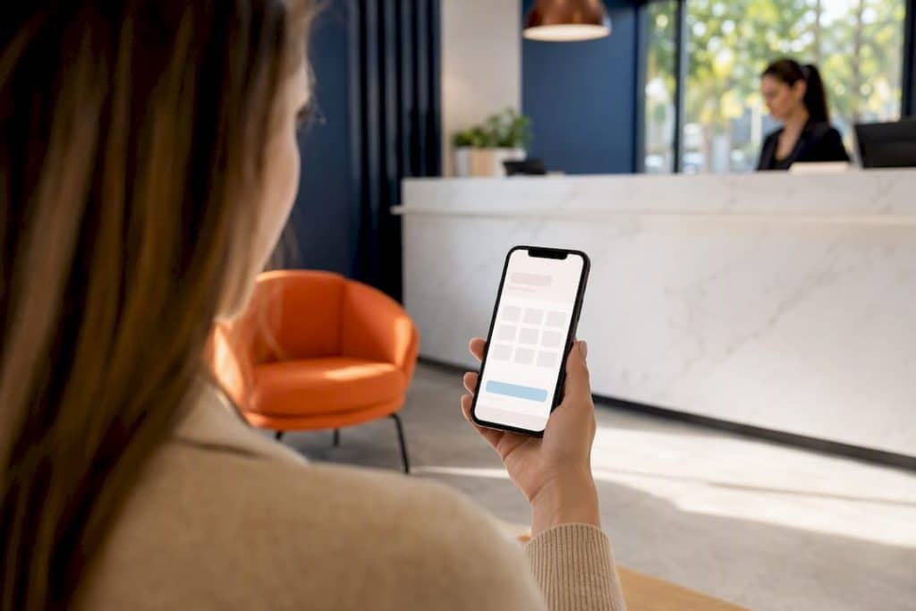
Cut the booking flow to three interactions, show your price up front, and fix the mobile calendar. Those three changes account for most of the booking page conversion gains service businesses see, and small design fixes alone can double conversion rates in some cases. The sections below walk through exactly how to implement each one, plus the trust signals, testing plan, and payment setup that round out a page people actually finish.
TL;DR:
- Showing prices and defaulting to the next available slot significantly boost booking conversions, with visible pricing increasing results by around 17 to 24 percent.
- Mobile page speed under two to three seconds and a simplified, three-field booking form are crucial for reducing drop-offs and increasing completion rates.
- Placing trust signals, such as reviews, provider credentials, and security badges, near the CTA reduces booking anxiety, especially when collecting payments.
- Limiting available times to five to eight slots and auto-detecting time zones improve mobile usability and prevent choice overload.
- Testing core elements like form fields and pricing first yields the fastest wins, with measurable improvements often appearing within two to six weeks.
Table of Contents
- What Makes a Booking Page Convert Above the Fold?
- Why Does Mobile Speed Decide Most Booking Outcomes?
- How Many Fields Should a Booking Form Actually Have?
- Should You Show Prices and Create Urgency on a Booking Page?
- Where Should Trust Signals and Testimonials Go?
- How Should a Calendar Handle Time Zones and Slot Display?
- What Metrics and Tests Actually Move Booking Numbers?
- How Do Confirmations and Reminders Cut No-Shows?
- What Do Clinics Usually Get Wrong Before Fixing Their Booking Page?
- How Do You Handle Payments Securely on a Booking Page?
- How Can You Personalize a Booking Page Without Overcomplicating It?
- How Should Cancellations and Rescheduling Work?
- What Should You Test First?
- How Adjetmarketing Turns Booking Pages Into Booked Patients
- Where to Verify These Benchmarks Yourself
- Sources
What Makes a Booking Page Convert Above the Fold?
A visitor decides whether to trust your page in under a second. Research from Nielsen Norman Group, cited in booking-page benchmarking studies, shows people form opinions in less than 50 milliseconds, so everything critical needs to sit above the fold with zero digging required.
That means four things visible without scrolling: the service name, its duration, a price or “starting from” figure, and a CTA button the eye can’t miss. Skip the price and you’re asking visitors to click deeper into your funnel just to find out if they can afford you, which is exactly where most abandon.
Provider identity matters more than most owners assume. A host photo and a clinic logo next to the booking widget humanize what’s often a high-stakes decision, especially for medical, aesthetic, or mental health services where trust precedes commitment.
Your checklist for the fold:
- Service name, duration, and price stated plainly, not buried in a “learn more” link
- A CTA with real color contrast against the background, not a pale button that blends in
- Descriptive CTA text (“Book My Consultation”) instead of a generic “Submit”
- Sticky CTA placement on longer pages so the button follows scroll
- A visible provider photo or logo for services where trust is part of the sale
Pro Tip: Run a five-second test with someone unfamiliar with your business. If they can’t say the service, price, and next step after five seconds of looking, your fold has a problem.
Why Does Mobile Speed Decide Most Booking Outcomes?
Mobile traffic now makes up 40 to 60 percent of booking visits for most appointment-based businesses, and a page that works fine on a laptop often falls apart on a phone. Calendar grids that require pinching to zoom, buttons packed too close together, and widgets that take five seconds to load are the most common ways clinics lose mobile bookings without ever knowing it.
The fixes are mechanical, not creative. Use single-column layouts, make every tap target at least 44 by 44 pixels, and put the CTA where a thumb naturally rests, not stretched toward the top corner. Aim for a load time under two to three seconds, which usually means compressing images, deferring non-critical scripts, and loading your booking widget asynchronously so it doesn’t block the rest of the page.
Test it the way a real visitor would:
- Run a Lighthouse audit and fix anything flagged red for performance
- Walk through the actual booking flow on your own phone, not just a browser’s mobile preview
- Check time-to-interactive, since a page that looks loaded but doesn’t respond to taps yet is worse than a slow one that’s honest about it
Pro Tip: Test your calendar widget on the oldest phone in your office. If it lags there, it’s losing bookings from a meaningful chunk of your mobile traffic.
How Many Fields Should a Booking Form Actually Have?
Three fields. That’s the ideal: name, email, and one conditional field, like phone number or reason for visit. Everything else, intake forms, insurance details, medical history, belongs after the booking is confirmed, not before it.
The math behind this is unforgiving. If each step in your flow completes at a 90 percent rate and you’ve built six steps into your funnel, only 53 percent of visitors make it through. Cut that to three steps and completion jumps to roughly 73 percent, the same drop-off rate compounding over fewer opportunities to lose someone.
Keep the flow moving with a few small habits:
- Use browser-autofill-friendly input types so phone and email fields populate automatically
- Skip CAPTCHAs on the booking form itself; save spam filtering for the backend
- If you need to qualify leads, ask one routing question at a time instead of a long intake form up front
- Push medical history, consent forms, and detailed intake to a post-booking email or portal
Should You Show Prices and Create Urgency on a Booking Page?
Yes, and the data backs it clearly. Showing price or a “starting from” figure increases conversion by roughly 17 to 24 percent compared with hiding it behind a “contact us for pricing” wall. Hidden pricing reads as a red flag to most visitors now, not as an invitation to call.
Availability presentation matters almost as much as price. Default to showing the next available slot rather than a full calendar grid, since most visitors want the easiest path forward, not a menu of forty options to sort through.
- Show a price or transparent starting rate directly next to the service, not on a separate page
- Default to “next available” for visitors who just want an appointment, with a calendar toggle for people who need a specific date
- Use honest scarcity cues like “2 spots left this week” only when the availability is real, never fabricated for pressure
Where Should Trust Signals and Testimonials Go?
Placement matters as much as content. Social proof positioned right next to the booking form works better than the same reviews buried on a separate testimonials page, because it reduces booking anxiety at the exact moment someone is deciding whether to commit.
For services involving payment, credentials, and personal information, that anxiety is higher, which makes the placement decision higher stakes too.
- Put your star rating and review count within eyeshot of the CTA, not scrolled below it
- Add one short, specific testimonial directly under the booking button
- Show provider credentials and security or payment badges wherever you’re collecting payment details
- Test different placements and measure completed bookings, not just clicks on the CTA
A four and a half star Google rating sitting next to your “Book Now” button does more work than a full testimonials page three clicks away.
How Should a Calendar Handle Time Zones and Slot Display?
Choice overload kills bookings. Showing a full month grid with every available and unavailable day forces visitors to hunt for options, and on mobile it often requires pinching and zooming just to tap the right date. Limit visible choices to five to eight slots, ideally the next available times, and let visitors expand from there if they want more.
Time zone handling is the quieter failure mode. Businesses serving multiple regions lose bookings to simple time zone mismatches when the calendar doesn’t detect where the visitor actually is.
- Auto-detect the visitor’s time zone and display times in it by default
- Add a clear, visible toggle to switch zones, with a “times shown in…” label so nobody has to guess
- Use a scrollable slot list on mobile instead of a grid that needs zooming
What Metrics and Tests Actually Move Booking Numbers?
Your primary KPI is bookings per booking-page visit, not raw traffic and not clicks on the CTA. Track step-level drop-off across your flow and your no-show rate separately, since a page can convert well and still bleed revenue if half the bookings never show up.
- Test CTA wording head-to-head (“Book Now” versus “Schedule My Consultation”)
- Test showing price versus hiding it behind a contact form
- Test “next available” as the default versus a full calendar view
- Test three form fields versus five or six to confirm the drop-off math holds for your audience
A rough ROI estimate is simple: multiply the change in conversion rate by your monthly booking-page visitors, then by your average booking value. A two-point lift on 2,000 monthly visitors at a $150 average booking value works out to an extra $6,000 a month, which is usually enough to justify the redesign hours. Industry benchmarks vary widely, with general pages often converting in the low single digits while dedicated, well-built booking pages reach 15 to 30 percent depending on intent and industry.
How Do Confirmations and Reminders Cut No-Shows?
The booking isn’t done when the form submits. Show an immediate on-screen confirmation with full appointment details and an add-to-calendar link, then follow up fast, since SMS confirmations get read far more reliably than email alone.
- Send SMS and email confirmation within 60 seconds of booking
- Schedule reminders at 24 hours and again at 1 hour before the appointment
- Include a one-tap reschedule link in every reminder, not just the initial confirmation
- State your cancellation and rescheduling policy plainly in both the confirmation and the reminders
What Do Clinics Usually Get Wrong Before Fixing Their Booking Page?
Most clinics that come to us have some version of the same three problems: a booking page that takes four or five seconds to load, a form asking for eight fields before anyone’s confirmed an appointment, and a calendar that’s unusable on a phone even though most of their traffic is mobile.
The first three fixes we apply, cutting form fields, adding visible pricing, and rebuilding the mobile calendar, typically show measurable lift within two to six weeks, as explained in Why Practitioners Need a Digital Presence Today. Quick fixes run days to a couple of weeks; a full redesign with new booking logic takes longer and costs more, but pays off for practices scaling paid traffic.
How Do You Handle Payments Securely on a Booking Page?
Payment integration is where booking pages either build trust or lose it in one click. If your service requires a deposit, prepayment, or full payment at booking, the gateway you choose and how visibly you display security matter as much as your calendar UX.
Stick to established, PCI-compliant payment processors rather than building custom payment handling. Stripe and Square remain the most widely used options for service businesses because they handle compliance, fraud detection, and card storage without requiring your clinic to touch sensitive card data directly. That matters for healthcare and aesthetic practices especially, since payment security sits alongside HIPAA considerations for anything tied to patient records.
Display security badges, like a lock icon and “secure checkout” label, directly on the payment step, not just in your footer. Visitors who’ve made it that far into the flow are the closest to booking, and a payment screen that looks unfinished or generic is enough to make them abandon at the last step.
A few practical rules:
- Offer at least one alternative payment method (card plus a digital wallet like Apple Pay or Google Pay) since forcing a single option adds friction
- If you require a deposit, state the amount and refund policy before the payment field, not after
- Never ask for full card details on a page without visible HTTPS and a security badge
- Keep the payment step to a single screen; splitting it across multiple pages reintroduces the drop-off problem you already fixed in your form
For clinics collecting deposits on higher-cost procedures, a clear cancellation and refund policy displayed right at the payment step reduces disputed charges later, which saves administrative time as much as it protects conversion.
How Can You Personalize a Booking Page Without Overcomplicating It?
Personalization sounds like a big technical lift, but the highest-impact version of it is simple: show returning visitors and new visitors slightly different things based on what you already know.
For a returning patient or client, that might mean pre-filling their name and email if they’re logged in, or showing “Book Your Follow-Up” instead of a generic service list. For a new visitor arriving from a specific ad campaign, matching the booking page’s headline and service shown to the ad they clicked keeps the message consistent and avoids the confusion of landing somewhere that doesn’t match what they expected.
Location-based personalization works well for multi-location practices. Detecting a visitor’s general location and defaulting the booking page to their nearest clinic location, rather than making them select from a dropdown, removes a decision point that has nothing to do with why they’re booking in the first place.
Referral source personalization is underused. A visitor coming from a Google Ads campaign for “teeth whitening” should land on a booking page about teeth whitening, not a general services page where they have to search for the right option. This is less about sophisticated software and more about matching your landing pages to your ad groups carefully, something that pays off directly in Google Ads campaign structure for service businesses running paid traffic.
Keep personalization additive, not required. A page that breaks or looks broken when personalization data isn’t available is worse than a slightly generic page that always works.

How Should Cancellations and Rescheduling Work?
A booking flow that’s easy to enter but painful to exit creates resentment, and resentment shows up in reviews and referral rates, not just no-show numbers. The same three-click principle that governs your booking form should govern cancellations and rescheduling too.
Every confirmation and reminder message needs a direct reschedule and cancellation link, not a phone number the visitor has to call during business hours. Self-service cancellation reduces staff time spent on the phone and reduces the friction that turns a simple reschedule into a full no-show instead.
State your policy plainly and early, not buried in fine print discovered only when someone tries to cancel. A 24-hour cancellation window with no penalty, followed by a stated fee for late cancellations, is common across service businesses and rarely causes pushback when it’s communicated upfront rather than sprung on someone after the fact.
For rescheduling specifically, offer the same next-available-slot logic you use for new bookings. Forcing someone back through a full calendar grid to reschedule a single appointment reintroduces the choice overload problem you already solved for first-time visitors.
A few workflow details worth getting right:
- Automatically release the original slot back into availability the moment a cancellation is confirmed
- Send a confirmation of the cancellation or reschedule, not just the original booking, so there’s no ambiguity about what happened
- Track rescheduling patterns; a high volume of last-minute reschedules for one service can point to a scheduling or expectation-setting problem upstream, not a booking-page problem
What Should You Test First?
If you only fix one thing this month, cut your booking form to three fields. If you can fix two, add visible pricing next. Everything else on this page compounds from there, but those two changes tend to move the needle fastest for the least development effort. Measure before and after, give each test at least two to three weeks of real traffic, and don’t be afraid to reach out if you want a second set of eyes on the numbers.
— Felix
How Adjetmarketing Turns Booking Pages Into Booked Patients
Adjetmarketing is the alternative to guessing your way through a redesign. Where most clinics rebuild a booking page once and hope, we build it as a tested system, fixing form length, mobile calendar usability, and pricing transparency, then measuring the actual lift in booked appointments over the following weeks rather than assuming it worked.
DIY fixes make sense if you’re comfortable auditing your own analytics and have a developer on call for calendar and speed issues. If you’re running paid traffic, managing multiple locations, or don’t have the bandwidth to test methodically, hiring a specialist usually pays for itself faster. Most clients see measurable booking lift within four to eight weeks of a coordinated redesign paired with medical marketing strategy built around their actual patient funnel, not a generic template.
If your booking page hasn’t been touched in a while, that’s usually the first place worth looking before spending more on ads to send it traffic.
Where to Verify These Benchmarks Yourself
For deeper reading, RZRV’s booking-page best-practices guide covers the conversion math behind step reduction, and SchedulingKit’s optimization breakdown has the pricing-transparency figures in more detail. For technical testing, run Google’s Lighthouse for speed audits and always walk your own flow on a real phone before trusting a desktop preview.
Sources
- Online Booking Page Best Practices: Convert More Visitors Into Appointments | RZRV
- Social proof: How to use testimonials, reviews & trust signals to increase conversions | Gravity Forms
- How to Create a Booking Page That Converts — Optimization Tips (2026) | SchedulingKit