









The best medical landing pages get patients to act quickly because they lead with a patient-focused headline, put trust signals above the fold, and give visitors exactly one primary call to action to follow. That combination matters more for clinics, med spas, and specialty practices than clever design or a big budget. Everything below breaks down how to build it, step by step, with real patterns you can copy.
TL;DR:
- Trust signals like credentials and reviews should be placed above the fold along with the headline to immediately establish credibility.
- The primary call to action must be clear, specific, and repeated throughout the page to minimize hesitation and guide visitors toward booking.
- Fast-loading pages with mobile-first design, simple icons, and optimized images significantly improve conversion rates, especially for anxious or hurried patients.
- Keeping forms short, positioned strategically, and integrating a live calendar reduces booking friction and increases actual appointments.
- Ensuring message match between ad copy, headline, and the landing page is crucial for lead quality, as load speed and clear language outperform galleries or design embellishments.
Table of Contents
- What Makes Medical Landing Pages Convert Well?
- What Elements Should Every Healthcare Landing Page Include?
- How Should Design Choices Support Trust and Conversion?
- What CTA and Form Design Actually Reduces Booking Friction?
- How Do Accessibility and Speed Affect Conversions?
- What Compliance and Privacy Steps Do Healthcare Pages Need?
- How Do You Test and Improve a Medical Landing Page Over Time?
- What Do Real Clinic Projects Actually Look Like?
- Why the Standard Advice on Medical Landing Pages Falls Short
- Get Your Medical Landing Page Built Right the First Time
- Sources
- FAQ
What Makes Medical Landing Pages Convert Well?
Every high-performing healthcare landing page follows a version of the same pattern: fast trust, low friction, one obvious next step. Landingi’s research on healthcare landing pages confirms that pages converting well simplify the path to booking and never make the visitor guess what to do next. That’s the whole game. A page that looks polished but buries its phone number in the footer will lose more patients than a plain page with a click-to-call button in the hero.
Here are the layout patterns worth studying and copying:
- Hero booking pages. A short headline, a subhead naming the condition or treatment, and a scheduling widget or click-to-call button visible without scrolling. These work best for urgent-care, dental, and pain management pages where the visitor already knows they need an appointment.
- Treatment-specific pages. Built around one procedure or condition, with tight outcome-focused copy and a before-and-after gallery when the specialty allows it. Colorlib’s roundup of med spa websites shows these galleries paired with clear treatment categorization consistently outperform generic “our services” pages.
- CME and whitepaper pages. Aimed at providers or referral sources rather than patients, these use multiple CTAs and reward depth over speed. Health Union’s analysis of standout healthcare pages notes that education-focused pages keep visitors on-site longer because the goal isn’t an instant booking, it’s a lead or a download.
Design galleries like Dribbble’s medical landing page tag are worth a scroll for visual ideas, but treat them as a mood board, not a blueprint. Borrow the layout logic, not the whole design. A gorgeous hero image means nothing if it pushes your CTA below the fold on mobile.
What Elements Should Every Healthcare Landing Page Include?
Run a new page against this checklist before it goes live.
- Patient-focused headline. Pass the three-second test: can a stressed visitor tell what you treat and who you treat within three seconds? If not, rewrite it.
- One primary CTA. Book, call, or request a consult. Pick one action and repeat it two or three times down the page, not five different competing buttons.
- Trust signals above the fold. Provider credentials, board certifications, and a review star rating belong near the headline, not buried in an “About Us” section nobody scrolls to.
- Scannable copy. Short paragraphs, benefit bullets, no walls of clinical text. Patients skim; they don’t read landing pages the way they read a diagnosis letter.
- Frictionless contact options. Click-to-call on mobile, a calendar widget on desktop, and a form that asks for the minimum needed to schedule.
Landingi’s guidance and Health Union’s breakdown of high-performing healthcare pages both point to the same conclusion: pages that build trust fast and keep the CTA singular convert at a noticeably higher rate than pages trying to do everything at once.
Pro Tip: Put your credentials and star rating in the same visual block as your headline, not below it. Patients decide whether to trust you before they decide whether to read your copy.
For clinic owners who want the fundamentals spelled out further, our landing page primer for clinic owners walks through the basics in plain language.
How Should Design Choices Support Trust and Conversion?
The visual register you pick sends a message before a single word gets read. A clinical-clean aesthetic, white space, blue and white palettes, simple icons, tends to reassure anxious patients booking a first appointment. A dark-luxury aesthetic, black backgrounds, gold accents, dramatic photography, works for med spas selling elective aesthetic services where the patient is shopping for an experience, not urgent care. Mismatch the two and conversion suffers: a pain clinic with a nightclub aesthetic reads as untrustworthy, and a Botox landing page that looks like a hospital intake form feels cold.
A few rules apply regardless of aesthetic:
- Get documented consent before publishing any before-and-after photo, and write real alt text describing the image, not just “photo1.jpg.”
- Compress images aggressively. A stunning hero photo that takes four seconds to load costs you more patients than a slightly duller one that loads instantly.
- Design mobile-first with a persistent CTA button that stays visible while scrolling, and collapse secondary details behind expandable sections so the page doesn’t feel like a wall of text on a phone screen.
- Keep your heading hierarchy strict: one clear H1-style headline, subheads that name benefits, and bullet points instead of dense paragraphs.
Platform choice matters here too. Colorlib’s med spa website research points out that boutique practices often do fine on simpler platforms, while multi-location groups need something built to scale. If you’re rebuilding from scratch, our guide to designing high-converting landing pages covers the platform and layout tradeoffs in more detail.
What CTA and Form Design Actually Reduces Booking Friction?
Vague CTAs like “Learn More” underperform specific ones. “Book Your Free Consultation” or “Check Available Times” tells the patient exactly what happens next, and specificity reduces hesitation.
A few patterns worth applying directly:
- Keep forms short: name, phone, preferred appointment window. Anything beyond that belongs in a follow-up call, not the landing page.
- Use progressive disclosure. Show three fields first, reveal insurance or condition details only after the visitor commits to starting the form.
- Integrate a live calendar wherever possible. A patient who can pick a time slot immediately is far less likely to abandon the page than one who has to wait for a callback.
- Repeat the CTA at the top, middle, and bottom of the page, using identical wording each time so the visitor never has to relearn what to click.
Watch three numbers closely once the page is live: form completion rate, phone calls generated, and how many of those leads turn into actual booked appointments. A page with a great completion rate but poor booking follow-through usually signals a lead quality problem, not a design problem, and that distinction changes what you fix next. Landingi’s healthcare landing page findings note this exact pattern: simplifying the booking path raises completion rates, but only clear CTA copy keeps the resulting leads relevant.
How Do Accessibility and Speed Affect Conversions?
Accessible pages convert better for healthcare audiences because the patients researching a diagnosis are often anxious, on a phone, and in a hurry, exactly the conditions that punish a slow, hard-to-navigate page. Cover the basics:
- Label every form field, keep color contrast readable, and make sure the whole page works with keyboard navigation alone.
- Use responsive images with srcset, lazy load anything below the fold, and target a Largest Contentful Paint under 2.5 seconds.
- Cut oversized hero videos and unnecessary third-party scripts. They’re the two most common speed killers on healthcare pages.
Baby Love Growth’s guide to web accessibility and SEO is a useful reference if you’re building compliance into your process from the start rather than patching it in later.
What Compliance and Privacy Steps Do Healthcare Pages Need?
Any form that collects health condition details alongside contact information can create protected health information, and that’s the point where you loop in legal or HIPAA counsel rather than guessing. A few non-negotiables:
- Keep clinical claims conservative and verifiable. Avoid language that promises specific outcomes.
- Get written, documented consent before publishing patient testimonials or before-and-after photos.
- Link your privacy policy clearly, and list a real contact for data-processing questions.
- Look at how Caris Life Sciences structures its Caris Detect page: safety information and next-step guidance sit right alongside the ordering and contact flow, not hidden in fine print.
How Do You Test and Improve a Medical Landing Page Over Time?
Testing on a medical landing page works best in a fixed sequence, not a scattershot approach.
- Start with the headline. It has the biggest single impact on whether visitors keep reading.
- Test the CTA wording next, comparing specific phrasing against generic phrasing.
- Then test form length, shorter almost always wins on completion rate.
- Move to trust signal placement, then imagery last, since images tend to move the needle the least of the five.
Track conversion rate, appointment rate, phone call volume, and lead quality using standard analytics events, session recordings, and heatmaps. AI-assisted landing page tools like Landingi are speeding up how fast teams can spin up test variants, but the underlying testing discipline hasn’t changed: don’t call a test until you have enough traffic to trust the result.
Pro Tip: Give each test at least two to four weeks and enough volume to see a real pattern, not just a lucky week. Calling a test early is the single most common mistake we see clinics make.
What Do Real Clinic Projects Actually Look Like?
Most landing page projects run through five phases: discovery, design, build, test, iterate. A single-page campaign for one clinic location typically moves faster and costs less than a multi-location rollout, where you’re building templated pages that still need local trust signals and location-specific booking flows.
Many clinics come to us after reported a landing page generated plenty of form fills but almost no real patients, which almost always traces back to one of three problems:
- Vague form copy that attracts price shoppers instead of qualified patients
- A slow-loading page that drives high bounce before the form ever loads
- A CTA that doesn’t match what the ad promised, which erodes trust the moment someone lands
Fixing lead quality issues is usually less about redesigning the whole page and more about tightening the message match between the ad and the landing page headline. That single fix resolves more lead-quality complaints than any visual overhaul we’ve made.
Why the Standard Advice on Medical Landing Pages Falls Short
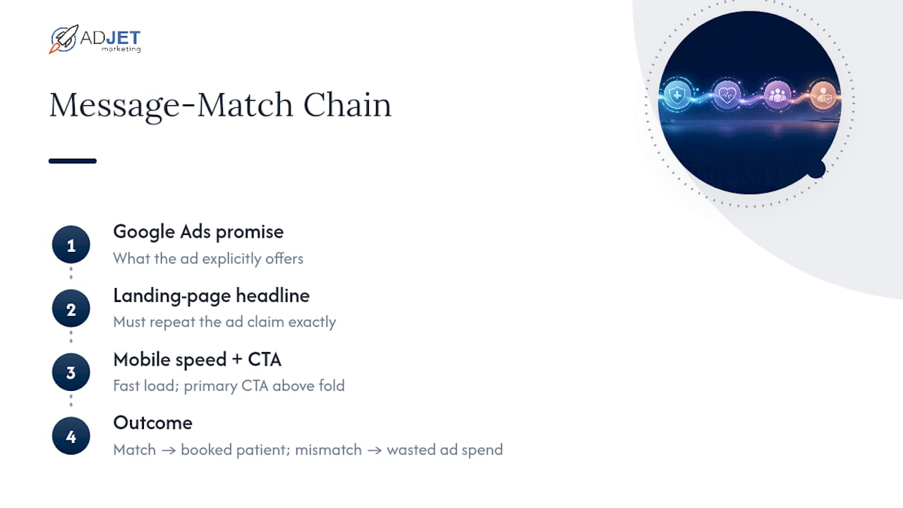
Most guides treat medical landing pages like a design problem: pick a nice template, add a photo of a smiling doctor, done. That’s backwards. The design is the easy part. What actually separates a page that converts from one that quietly bleeds ad spend is message match, the gap between what your Google Ads copy promises and what your landing page headline delivers.
Conventional wisdom also overrates before-and-after galleries and underrates load speed. A gallery is persuasive once the visitor has already decided to stay. Speed decides whether they stay at all. We’ve seen practices spend weeks perfecting photography while the page takes six seconds to load on mobile, which quietly costs more leads than a mediocre image ever would.
If you’re prioritizing anything first, prioritize this: get the headline and the ad copy saying the same thing, get the page loading fast on a phone, and put your primary CTA in front of the visitor before they have to scroll. Everything else, the trust badges, the galleries, the microcopy, matters, but it matters less than those three fundamentals working together.
— Felix
Get Your Medical Landing Page Built Right the First Time
We build and manage landing pages designed for clinics, med spas, and specialty practices, focusing on compliance and conversion alignment. We handle the design, the trust signal placement, the form logic, and the ongoing testing that most in-house teams don’t have time for, all while keeping the page aligned with the Google Ads campaigns driving traffic to it. If you want a starting point before committing to a full project, grab our Medical Clinic Marketing Checklist for 2026 and run your current page against it today.
Sources
- Healthcare Landing Page: Best Practices & Examples | Landingi
- 8 Of The Best Healthcare Landing Pages & Why They Work | Health Union
- 28 Best Med Spa Website Examples 2026 – Colorlib
- Caris Detect | Caris Life Sciences
FAQ
How Long Should Testing a New Landing Page Take?
Give each test at least two to four weeks with enough traffic to see a reliable pattern, rather than calling results after just a few days.
Does a Contact Form Count as Protected Health Information?
It can, especially if it asks for condition or symptom details alongside contact information, which is when you should involve legal or HIPAA counsel before launch.
Do I Need Written Consent for Before-and-After Photos?
Yes. Document patient consent before publishing any before-and-after image or testimonial, regardless of how minor the procedure seems.
What’s the One Change Most Clinics Should Make First?
Match your landing page headline to your ad copy exactly. Message mismatch is the most common cause of poor lead quality Adjetmarketing sees in new client audits.
Are Trust Badges Worth Including?
Yes. Credentials, review counts, and accreditation badges reduce decision friction and belong above the fold, not in a footer nobody scrolls to.